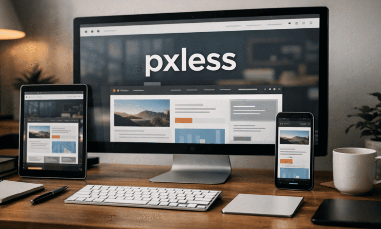
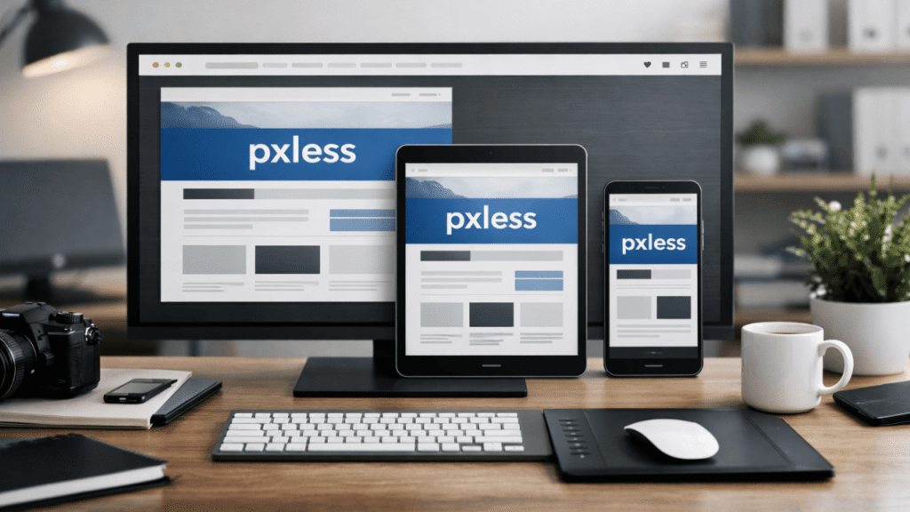
Pixel obsession has wasted years of web design time. Perfect spacing at 1440px, broken layouts at 375px, endless breakpoint hacks, and typography that collapses the moment a user changes default font size. pxless pushes back against that mindset. It treats screens as elastic, not grids carved in stone. Once you stop chasing pixel precision, the work gets calmer, faster, and far more durable.
Why fixed layouts keep failing in real-world usage
The web no longer lives inside predictable rectangles. Users resize windows, zoom text, rotate devices, and browse on screens designers never preview. Pixel-locked layouts crack under that pressure. They snap instead of stretching. They overflow instead of adapting.
pxless design survives those conditions because it assumes instability from the start. Layouts stretch. Spacing breathes. Text grows without detonating the grid. That resilience isn’t theoretical. It shows up the moment a site meets a real user instead of a mockup.
Pixel-based systems pretend control exists. pxless accepts that it never did.
How pxless changes layout decisions at the foundation level
When pixel values disappear from your mental toolkit, decisions shift upstream. Container widths stop being numbers and start being relationships. Spacing becomes proportional. Components stop caring about exact dimensions and start caring about context.
Designing this way reduces the need for endless breakpoint overrides. A card that scales naturally doesn’t need three separate width rules. A layout built with relative flow doesn’t panic at intermediate screen sizes.
pxless also exposes weak design thinking. If a layout only works at one width, it wasn’t strong to begin with. Flexible systems reveal whether hierarchy, spacing, and content weight actually make sense.
Typography behaves better when pixels leave the room
Text suffers the most under pixel-heavy design. Fixed font sizes ignore user settings, accessibility tools, and platform defaults. That’s how unreadable interfaces are born.
pxless typography scales with intent. Headings grow relative to base text. Line lengths adjust naturally as containers resize. Vertical rhythm survives zooming instead of collapsing.
This isn’t about fashion. It’s about respecting how people read. When users increase font size and the layout still holds, trust goes up. When they don’t have to fight the interface, they stay longer.
Accessibility stops being an afterthought
Pixel-locked layouts fight accessibility tools. Screen magnifiers break grids. Increased text size causes overlap. Touch targets miss their marks.
pxless removes most of those conflicts by default. Relative units respond to user preferences instead of overriding them. Spacing scales with text. Interactive elements remain reachable.
This doesn’t replace accessibility testing, but it removes a major source of friction. It also forces designers to stop treating accessibility as an optional layer. When the system itself adapts, compliance stops feeling like punishment.
Maintenance costs drop when layouts stop being brittle
Pixel-based CSS ages poorly. Every new device exposes another edge case. Every content change threatens spacing. Teams end up stacking fixes on top of fixes.
pxless systems age slower. Because relationships drive layout, content changes rarely require rewrites. A longer headline doesn’t shatter the design. A translated paragraph doesn’t force a redesign.
That stability matters on real projects with budgets and deadlines. Maintenance becomes predictable. Refactors become smaller. Teams spend less time babysitting CSS and more time improving actual experience.
pxless fits modern CSS tools instead of fighting them
Flexbox and Grid were built for fluid layouts. Pixel-heavy design uses them reluctantly, often forcing rigid values into flexible systems. pxless lets these tools do what they were designed to do.
Grids distribute space intelligently. Flex containers adapt without micromanagement. Gaps scale with context instead of staying frozen. The codebase becomes shorter, clearer, and easier to reason about.
This alignment matters when teams grow. New developers understand intent faster when layout logic is relational instead of numeric guesswork.
Performance benefits show up indirectly but consistently
pxless doesn’t magically speed up websites, but it removes patterns that slow them down. Fewer media queries. Less layout thrashing. Fewer overrides fighting each other.
Cleaner CSS parses faster. Simpler layout logic reduces reflow issues. The result isn’t flashy, but it’s measurable over time, especially on content-heavy sites.
Performance gains also show up in human terms. Developers move faster. QA finds fewer layout bugs. Releases stop being delayed by edge-case screens.
Design systems mature faster under pxless rules
Design systems collapse when they rely on exact measurements. Components become fragile. Variants multiply. Documentation bloats.
pxless encourages component thinking that scales. Buttons care about padding relative to text. Cards adapt to container width. Sections space themselves based on content weight.
This creates systems that grow without constant redesign. New components inherit behavior instead of reinventing it. Teams stop debating pixel values and start discussing hierarchy and intent.
Where pxless gets misunderstood and misused
Some teams swing too far and abandon structure entirely. pxless doesn’t mean chaos. It still requires constraints, ratios, and limits. Without them, layouts feel loose and unprofessional.
Others treat pxless as a trend rather than a discipline. They remove pixels but keep rigid thinking. The result looks flexible but behaves poorly under stress.
The shift only works when mindset changes first. Relative units are tools, not magic. They amplify good design and expose bad decisions quickly.
pxless and the future of unpredictable screens
New device categories aren’t slowing down. Foldables, large displays, embedded browsers, accessibility tech, and user-controlled environments keep expanding.
pxless doesn’t chase these changes. It ignores them. That’s the point. By refusing to design for specific screens, it works across all of them.
This approach doesn’t age out. It becomes more relevant as variability increases. Designers who adopt it early spend less time reacting and more time building.
The cultural shift pxless demands from teams
Pixel debates feel productive, but they’re often avoidance. They replace real design discussion with false precision. pxless removes that crutch.
Teams have to talk about content priority, reading flow, and interaction weight. They have to agree on what matters instead of arguing over numbers.
That shift can be uncomfortable. It also leads to better outcomes. Strong design decisions survive flexibility. Weak ones don’t.
pxless isn’t optional anymore
Web interfaces live in hostile environments. User control is growing, not shrinking. Devices are fragmenting. Accessibility expectations are rising.
pxless handles all of that without drama. It doesn’t need constant tuning. It doesn’t beg for exceptions. It just adapts.
Designers who cling to pixel certainty will keep firefighting. Those who move past it will build systems that last.
The takeaway is simple. Stop designing for screenshots. Start designing for behavior. pxless isn’t about removing pixels from code. It’s about removing fear from layout decisions.
FAQs
What’s the fastest way to shift an existing project toward pxless without a full rewrite?
Start with typography and spacing. Replace fixed font sizes and margins with relative units first. Layout changes can follow once the text behaves correctly.
Does pxless work for highly branded or editorial sites?
Yes, and often better. Strong brand systems rely on proportion and rhythm, not rigid measurements. pxless reinforces those qualities.
Will designers lose control if everything becomes flexible?
Control shifts, it doesn’t disappear. The focus moves from exact sizes to visual hierarchy and relationships, which are more durable forms of control.
Is pxless harder for junior developers to understand?
It’s harder at first, easier long term. Once they grasp relationships instead of memorizing numbers, mistakes drop quickly.
Can pxless coexist with pixel-based elements at all?
It can, but sparingly. Some icons or borders may still use pixels. The core layout should remain flexible to avoid cascading rigidity.